Translator

Saturday 27 September 2014

Vintage Layered Card


Click to Enlarge

Hi Everyone, and a warm welcome to my new followers.
For my DT card over at Cheery Lynn Designs this week I thought I would share a vintage style.


The first 2 layers glued onto my card were torn at the edges and some distress added to the edges and I placed my tiny doily onto both sides. My next layer, I die cut out the Horizon Square Frame, distressed the edges and added some creases onto the paper and placed my die cut heart.


My image I glued lace around and added to my Magic Mirror die which I had distressed the edges on and added some gilding wax too.


Layers of different leaves and flourishes were added which I cut out in different coordinating papers. My roses were die cut from white cardstock. I shaded the paper with my Copics before building my roses.


Finally adding a few pearls on my card to finish.

Cheery Lynn Dies Used:


Thanks for stopping by and I hope you have a creative weekend.

Friday 26 September 2014

Autumn Inspiration


Thanks for popping over to my blog today, nice to have you visit and a warm welcome to my new followers. I gathered my inspiration from my garden and the thought of a beautiful morning walk through a forest, with all the changes of the leaves now started and my beloved little Robin - Ronald is in the garden every day with his beautiful song. 

Say Hi To Ronald

Autumn is finally upon us and not long now until the clocks go back and our dark winter nights will be upon us.


Thinking of Tim's different techniques I decided to use his stains for the effect I wanted of mottled leaves, so I first started by staining strips of paper with shades of distress, spraying with water and swiping through as Tim demo's on his blog. You will see in my photo the top strip is with one colour and as I add different stains the change in my paper. I repeated this process using different colours.


I next ran through my sizzix Tattered Leaves strip. Tim demo's to leave your die cuts in the strip whilst you add some more stamping for texture rather than doing all your leaves individually and it does make it so much easier. I used some gold embossing on some of my leaves, brown Archival stamped on others with rock candy crackle paint on top. Lastly some leaves I pressed Versamark into leaves of others and embossed for a glossy feel.


Next stage was to dry emboss them all to give a curl to them after I had distressed some of them around the edges.


My clock which is to symbolise summer time ending I cut out in corrugated card. This was stained and distress powders added to it for a rustic feel.


My background was made by using Sizzix musical notes embossing folder. I used colour core so I could then sand it back. I tore the edges and added some tissue tape too. I used the musical notes from the inspiration of my Robin singing in the garden. Also stamping some leaves onto my paper with Archival ink.


I built up my card up and added a little black soot around the edges along with a bit gilding wax.  Added my die cut Robin, sentiment and a couple of metal embellishments to finish.


Thanks so much to everyone for all your amazing comments on my last two posts, I am so grateful for each and every one. If I have not paid your blog a visit yet, please bear with me I promise I will get there.

Have fun creating,


Julie x

I wish to enter this into the following challenges:

Wednesday 24 September 2014

CC3C Challenge 11


Hello, thanks for stopping by at my blog and a warm welcome to all my new followers.

We are now onto Challenge 11 over at Linda Ledbetter's CC3C Challenge. This fortnight the challenge is to use Tim's special Distress Embossing Powders. I can't tell you what to do or how to use them but if you check out Tim's book Compendium of Curiosities Volume 3 on page 52 all will become clear, but you have to use your own copy.

This fortnight the challenge is sponsored by the Sensational Inspiration Emporium with a generous shopping spree of $50, how cool is that ! And if that's not enough you also have a chance of being chosen by the Super Talented Curiosity Crew to win a bumper bundle of Tim's products, kindly donated by Tim and Mario.


For this challenge I had an idea of super glossy meets distress powder as I felt this would show a fabulous contrast and the effects these powders can do. I decided the best die to do this was Tim's Old Jalopy. I cut this out twice in heavy duty black card and glued together ever so slightly offsetting so you would see a little matte at the back edge of the car. I then pressed Versamark onto it and went over it 3 times with clear embossing powder heating from underneath to give a real glossy feel. My husband Chris now thinks I would do a marvellous job of polishing his car - NOT !!!  I die cut out my windows in Miri foil card and inserted back into the car.


The effect on the rest of my car you will find how to do in Tim's book. I also used this effect on my cogs and lamppost, using a variety of colours in the distress powders.


You will also notice on my lamppost I inserted mirri foil card, but this time I rubbed a little Rusty Hinge Stazon ink onto it before placing in my lamp. I love how the Ray stencil looks like light reflecting from my lamppost. I applied 3 colours of distress  when shading through my stencil.


I stitched around the edges for interest and added a collage with a stamped image, rub ons , fussy cut paper and emphemera to finish.

I also would just like to share with you all the most beautiful ATC's and personalised wallet I was lucky enough to win from the super talented Mo of Almocraft. If you are not familiar with Mo's work you must stop by and pay her a visit. Thanks again Mo. 


Thanks for looking at my card and Good Luck to everyone else entering the CC3 Challenges. And a extra big thank you on all your lovely comments. 

Happy Crafting,


 Julie x

I wish to enter this in to : 


Monday 22 September 2014

Little House of Curiosities


Hello Everyone, I am totally overwhelmed with all your comments here and at Country View Challenges on my project Memories at Sea and each and every one means the world to me. I am back with another exciting project to share with you all. Last month I was so honoured to be chosen for the second time as outright winner with Our Creative Corner for my Flowers in a Cart. So today I am showcasing my Little House of Curiosities on my blog and as Top Talent over at Our CreativeCorner today. 

Some of you will know already that I have a large Dolls House and before I became addicted to paper craft, I would love to craft for my dolls house. When I saw these little houses in my local craft shop my mind went into overdrive at what I could do with them. My idea in this one was to capture small accents of a large dolls house.


I initially gave the house a good sanding to which I applied some Gesso to seal it, followed by Grunge Paste through 2 different stencils. I then shaded on some Paper Artsy paints and added some Gilding wax.


My roof was an absolute labour of love. A Cheery Lynn flower die was used to give my tiled effect. I then cut out each individual petal and probably took 2 nights sitting in front of the TV curling the edges and gluing them all on my roof. Yes I must be crazy, but it was rather therapeutic lol.


My crackles were added to my house by stamping onto a paper handkerchief with Archival Ink. I then tore around the edges and applied onto my house with multi medium. This is a great technique to use especially when you want to get into awkward areas. The flourish accents were stamped onto my house with Flitter Glue and Gilding Flakes. 


I backed Bo Bunny papers onto the back walls, adding some Frantage on to some, glittered stencil paste, pearls, lace, stamping and Fussy cutting on other areas.


My chandelier was made in the same way I did on my Memories at Sea project, but this time I painted my candles white and added a chain to the top. 


My picture frame was painted white with some gilding wax added. I stamped my image, shaded with Copics and double embossed my image with powders to give it a faded look. 


My mannequin was a wooden button, I painted and added pearls to. I die cut out a butterfly twice and layered to the back interlocking on the metal embellishment. The problem now was to get this to stand without glue showing. I used a metal cabochon and poured some utee into it and quickly placed my mannequin into the hot utee. Hey presto a stand !


My little perfume bottles are all made from beads. Pearls, lace and small metal corners were added to finish.


I hope you have enjoyed your visit to my blog. Thanks once again to Our Creative Corner and the super talented design team for giving me this opportunity again.

Happy Crafting, 

 Julie x

I would like to enter this in to :


Sunday 21 September 2014

Memories at Sea


Hello there my fellow bloggers, I am delighted to have you stop by today and to be able to share my Nautical project with you on my blog and also on Countryview Challenges Blog after being chosen in their Top 3 Stencil It challenge. This is my second time as GD at Countryview and to say I was excited to be back is an understatement. Click on any of the pictures and they can be viewed larger.


For my Nautical project I decided to make a memory frame book that
held memories and keepsakes of a Victorian couple as they embarked on
their World Cruise and as they travelled the world picking up souvenirs. You may want to grab yourself a cuppa before you start reading my post as it goes into many details.


My book was made out of a couple of cereal boxes. I cut my card to
size, scored and glued down the spine. The finished outside measures 7x9 Closed by 2 inches in the spine.


Next I added a whole layer of tissue paper with multi medium crinkling it as I applied it. Once dry I placed a swirl stencil on top and added Grunge Paste for more texture and interest.

  
The spine I covered another piece of cereal box in tissue paper and added some string for dimension and then glued onto book.


Once this was all dry I applied a coat of gesso and a mix of Deco Art and Paperartsy paints with a brush and baby wipes, gradually building layers. I also spritz on some distress stains drying my layers in between as I built them up too. The stains pooled in the textured areas, giving depth. I finally highlighted with a little gilding wax, I now had my Olde Worlde look. My metal embellishments on the front and the corners were all given an aged rusty look, by adding some paint and distress powders, finally highlighting with a little gilding wax on them too.

Click to Enlarge


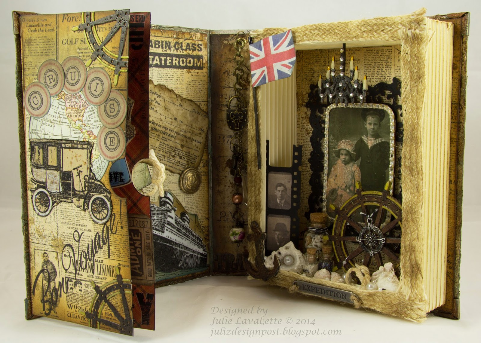
Now let's go inside. You will notice I carried my tissue paper and painting around the edges of the inside of my book. The pages glued onto the cover of my book, were yes, you guessed it cereal box again. This time I wrapped my patterned paper around the cardboard. I then distressed the edges and added some more random stamping to the pages and some of Tim's remnant rubs. I built up the arrangements onto these pages until totally happy with my layouts before finally gluing in.

  
My Eiffel Tower and anchor, I used distress powder on to give an aged rust look.


My ticket was stamped using Archival ink onto kraft card, I also stamped on little damp marks. I then tore around the edges, crumpled the paper and swiped through distress stain and distress the edges with ink. I made a mould from an old navy button my dad had. I then poured platinum utee into it and rubbed with gilding wax.


My ship I stamped firstly onto kraft paper and another on white card. This one I pressed into Versamark and embossed with powders twice heating from underneath to give a lovely glossy feel to the ship, of it being well polished . I then fussy cut it out and placed onto the kraft paper.


My Victorian couple - a free stamp, were coloured by Copics and fussy cut , I arranged a collage for interest. My little ships knots placed on the pages and in the frame my dad kindly made for me. After years in the Merchant Navy he has never forgotten this art.


The reason behind my jewellery embellishments hanging on the inside spine were to highlight a possible safe in their cabin to keep treasured keepsakes and the jewels worn. You will see a padlock, key, glasses and jewels on the chain.


Now for my picture frame. I decided on the size of frame I wanted and scored at half inch intervals, folding back and forward to mimic book pages, I glued into a box shape and added distress to age my pages. My Cheery Lynn anchor and ships wheel were both cut out of cereal packet and several layers glued together. My anchor was painted, distress powder and gilding wax added. My wheel was coloured with Copics.


My little bottles I placed Remnant Rubs onto, filled with sand, shells, glass beads and tied a little twine around them. My image from Tim's lost relatives pack, I coated with distress rock candy paint and once dry I added distress into the cracks. I decorated the edges with pearls and mounted onto my die cut. You will see in the mix some shells more pearls and another ships knot made by my dad.


My chandelier was to mimic some of the opulence in the ship. It started off as a wooden shape. I added ferro paste and pressed some bling onto it whilst still wet. My candles I used a distress pen on the wick and added glossy accents. The actual candle had beeswax dripped onto it.


Well I do hope you managed to get to the end of my post and have enjoyed reading my journey with this project. It was an absolute pleasure to make and the icing on the cake is it being showcased on CountryviewChallenges - thanks.

If you need to know anything about a product please just ask me. However, the majority of my products used will be found at CountryviewCrafts, fantastic service and 99% of the time next day delivery. Also CheeryLynn designs.

Would love if you have time to leave me a comment. 

Happy Crafting,

Julie x 


I would like to enter this in to :


LinkWithin

Related Posts Plugin for WordPress, Blogger...
01 09 10